I’m delighted to announce that the new online application for full-time student finance has been launched!
This represents a huge achievement for us and showcases the new way that we have been working – putting user needs at the heart of the redesign process.
More than 1.1 million students use this service, so delivering an enhanced online experience means we can make a big difference – most importantly to our customers, but also to our organisation.
Hilary previously blogged about the origins of the programme, but here are some facts and figures which illustrate why we needed to improve the previous application:
- Up to 80 screens presented to a student
- 350+ questions that a student could be asked during an application
- High rates of dissatisfaction, with the majority of students saying they either hadn’t achieved or, even worse, didn’t know if they’d achieved their goal in visiting the site.
- On average, applicants had to call us 3 times at some point during the application process
- Complex language and difficult navigation left students feeling confused and frustrated.
In line with the digital by default standard, we set out to transform the online service, with goals to:
- increase customer satisfaction
- minimise the level of assistance required throughout the process
- decrease the number of incorrect or incomplete online applications.
And now...
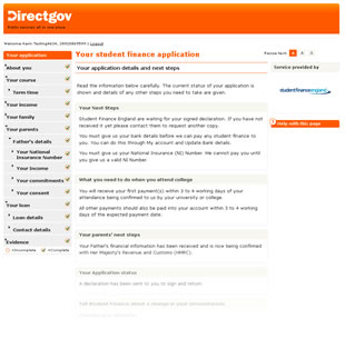
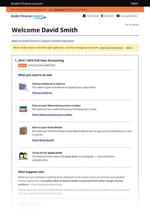
Moving forward to today, and our newly launched application:
- Clear navigation – the application is split into 7 sections which map to the customer’s mental model, backed up by an answer stack approach that allows students to review and change their answers as they go along
- Progressive disclosure – only one question asked at a time, improving usability
- Tailored to the individual – a student only sees the questions that are relevant to their particular circumstances
- User centric design – the design has been constantly enhanced in an iterative fashion, based on the results of usability testing with customers.
- Easier product choice - we now have a series of small decision points based around student’s needs for loans and grants, replacing the previous single big decision about means testing which was based on household income information that the student may not have known or understood. The means testing decision has now been transferred to the people who do know that information - the parents or partner supporting the application.
- Simplified language - less jargon, and help at the point of need
It’s a cliché, but getting from ‘then’ to ‘now’ has truly been a journey. It’s been full of hard work, surprising discoveries, new delivery partners, learning, hard work, mistakes (only a few – we are only human, after all), support from so many groups of people in SLC and across government, knowledge sharing, challenges, fun – oh, and did I mention hard work?
As we’ve been working towards this, we’ve also delivered the online application for part-time student finance, the online application for 24+ Advanced Learning Loans, a new login and registration process as well as revamping the customer account page. Everything we’ve learned as we built these has helped us in our delivery of this full-time application. You’ll be able to read more about this journey in future blogs, but in the meantime, I’d like to thank everyone who contributed in any way, including GDS who have worked with us and supported us throughout this journey.
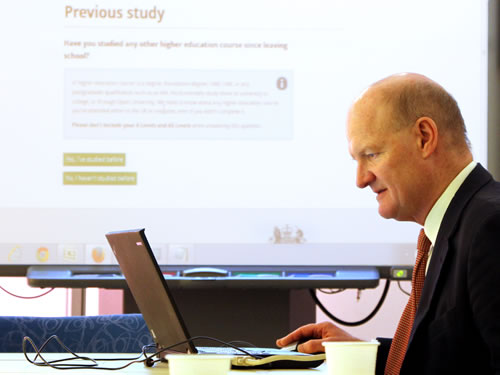
At the beginning of the month, the Universities Minister David Willetts tried out the application for himself.
We were initially given 30 minutes with the Minister, however he stayed for for almost an hour which was very encouraging. During this time, he completed an application unaided in 21 minutes and provided great feedback, including a few suggestions for improvements which we have now incorporated. We were delighted that he voiced his support and enthusiasm for the new application, and is keen to contact the NUS himself to let them know about the launch.
The student finance application doesn’t stand alone, so today also sees the launch of an enhanced online service for parents or partners of students to provide their financial information. This is vital, because if a student applies for the maximum support, we need this information to decide how much they should receive. There is also an improved account page for the student, where they can see the status of their application and any outstanding actions for them.
What next?
Our application is live. But that’s not the end of the story. In fact, it’s just the beginning!
While user testing gives us confidence that we have built a useable website, it’s only after it launches and people start to use it that we will see how good it really is.
Using online analytics, site monitoring mechanisms, feedback from users and from frontline staff, we’ll be able to quickly identify any trends that indicate problems or areas that need improvement. Any proposed changes and new requirements will be added to our backlog for prioritisation and future implementation.
We’ll also continue to do usability testing with students and make further improvements based on that.
As we embark on the next phase of our journey we will share what we learn here, so remember to keep checking back for updates on this and the other projects we’re working on.


4 comments
Comment by Andrew Robertson posted on
Hi Julie. Thanks for this update. A very minor question out of the huge improvements you've made, but it's timely I think. GDS are consulting on the use of logos on GOV.UK https://insidegovuk.blog.gov.uk/2014/01/22/use-of-logos-on-gov-uk-pages-draft-guidelines/.
I'm interested to hear how you decided to include the Student Finance England logo on the service. Was there user feedback that the logo was important? Did you have to justify this with GDS and what evidence did you use, or was it no problem and just added?
Also, the logo on the small screen-shot above is different to the one on the top right of the blog?
Thanks!
Comment by hilarybrownlie posted on
Hi Andrew,
We developed this application before GDS developed logo guidelines.
However, we'll certainly be chatting to them about the implications this might have for us
Thanks for your input.
Comment by Walnut Creek Chiropractor posted on
Congratulations. It's a much needed service and one that will hopefully get more people to apply given that it's much easier. Please do track the performance. When I worked for a local junior college, they did something similar. It was amazing to me they didn't keep track of the stats before and after to know if the system they implemented worked. Too bad because when it came to additional funding, they didn't have the metrics to back it up.
I love the logos but they appear to be all different? That could be somewhat confusing as people attempt to navigate the sites.
Comment by hilarybrownlie posted on
Thank you for your feedback! We are continuing to measure the sites usage to help identify what further improvements can be made. You can see some of our stats on the governments performance platform, if you're interested ... https://www.gov.uk/performance/transactions-explorer/service-details/bis-apply-for-student-finance-full-time-study
With regard to the logos, we are doing some research in this area too - thanks again